Thursday, May 16, 2013

CRICUT - CCR - Welded titles and shadows

This is an updated version of my original post from the Cricut Craft Room Blog.


There are two ways to type text using CCR. You can drag each letter from the keypad to the mat, or the better way is to use a Text Box. And that's what I'll be showing you today.

We'll be creating a welded title and a matching welded shadow.


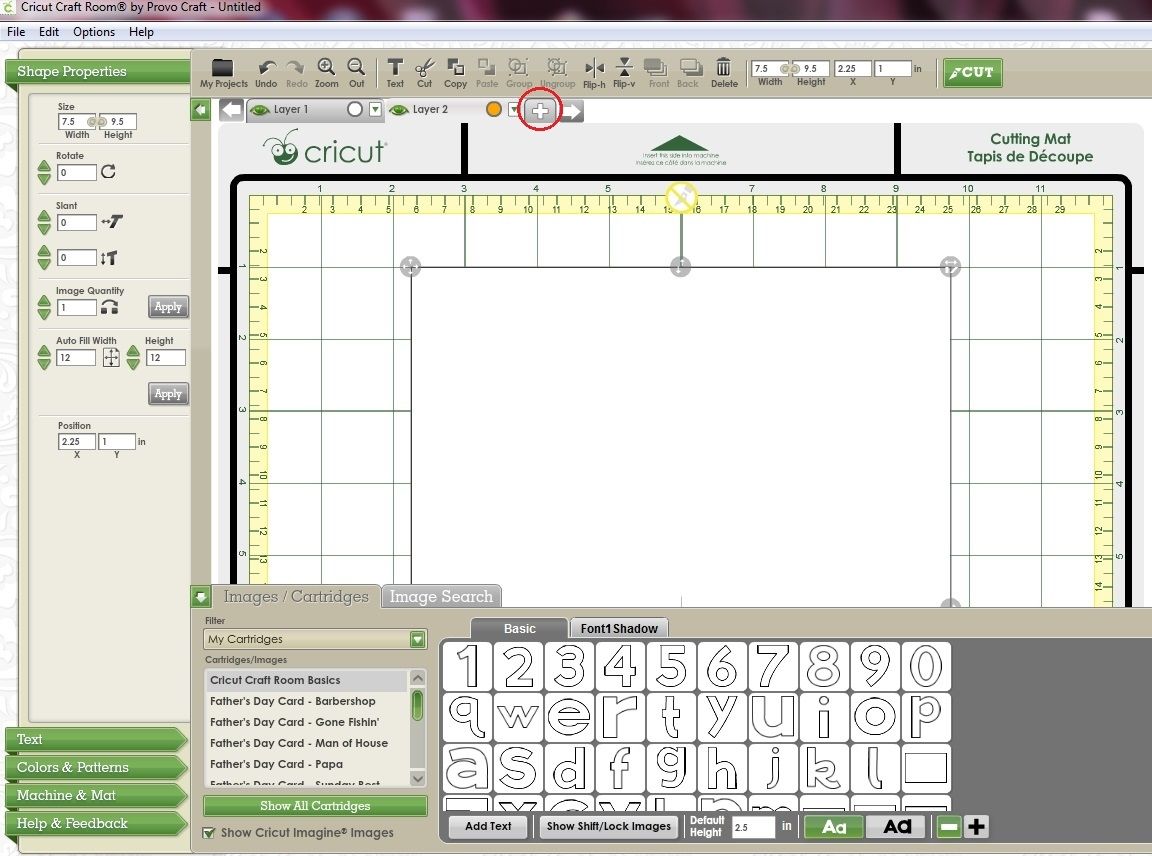
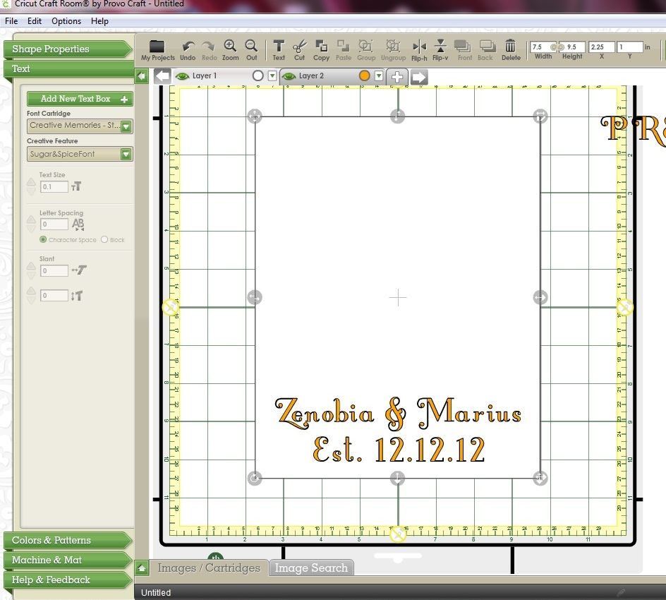
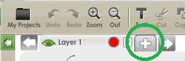
I have opened CCR and created two mat layers. To do that click on the + button next to the Layer 1 tab.


Because we won't be needing the keypad we can close the Drawer giving us a full view of the mat.
  • Click the arrow to the left of the keypad

You'll now have two layers in your design. The active mat layer's tab will be highlighted in light grey.

To make it easier to know which layer you're working on you can rename them if you wish. To do that:
  • Double click on the Layer 1 tab to highlight the layer name.

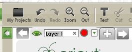
  • Delete the Layer 1 text and type in a new name. Press Enter.
  • Repeat for the second layer.

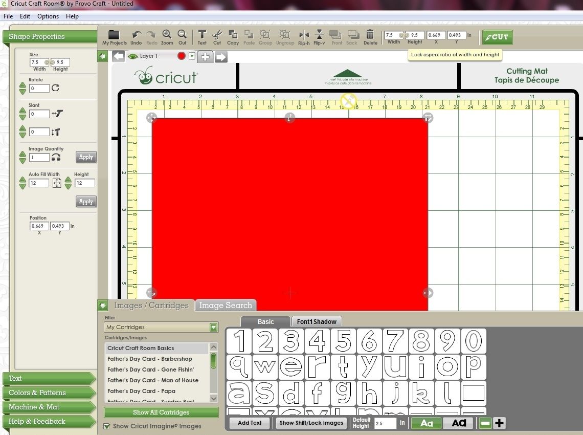
You may also wish to change the Preview colour of your mat layers. To do that:

  • Click on the coloured circle next to the layer name.


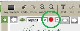
  • Select a new colour from the palette then press the Apply button.

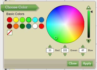
  • Repeat for the other layer.

Now we'll create our top layer.
  • Click on the first layer to make that mat active.
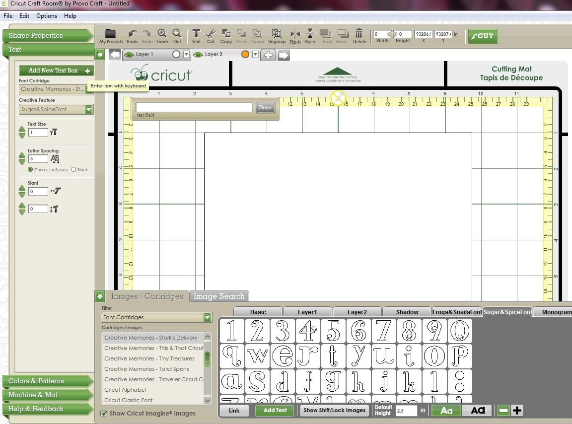
  • Click the Text menu, then click the Add New Text Box button

A text box will appear on your mat. 

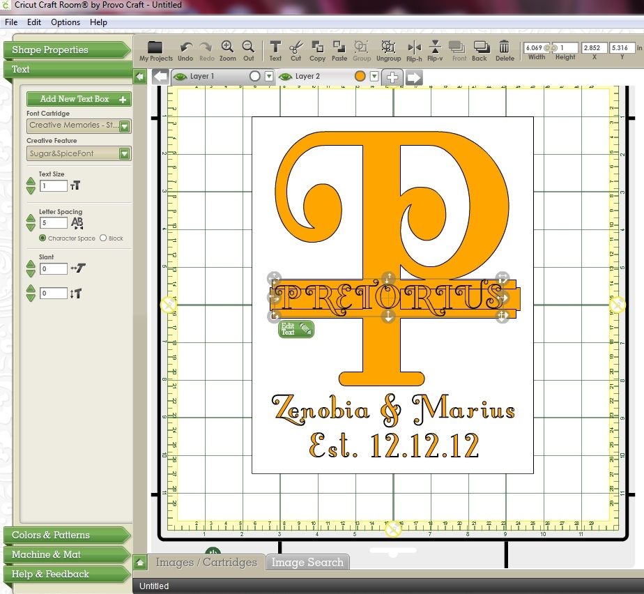
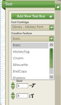
  • Select your cart from the Font Cartridge drop down list. I'm using Mickey Font. (Make sure the font you select has a matching Shadow feature.)


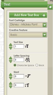
  • Make sure you have the base version of the font selected in the Creative Feature drop down box. In this case it's called Basic. (In some cases the Creative Feature names in CCR differ from those on the cartridge.)


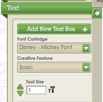
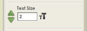
  • Select the size of your font by clicking on the green arrows or typing the new size in the box. (You can change the font size later if necessary). I selected a Font Size of 2.


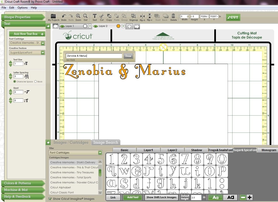
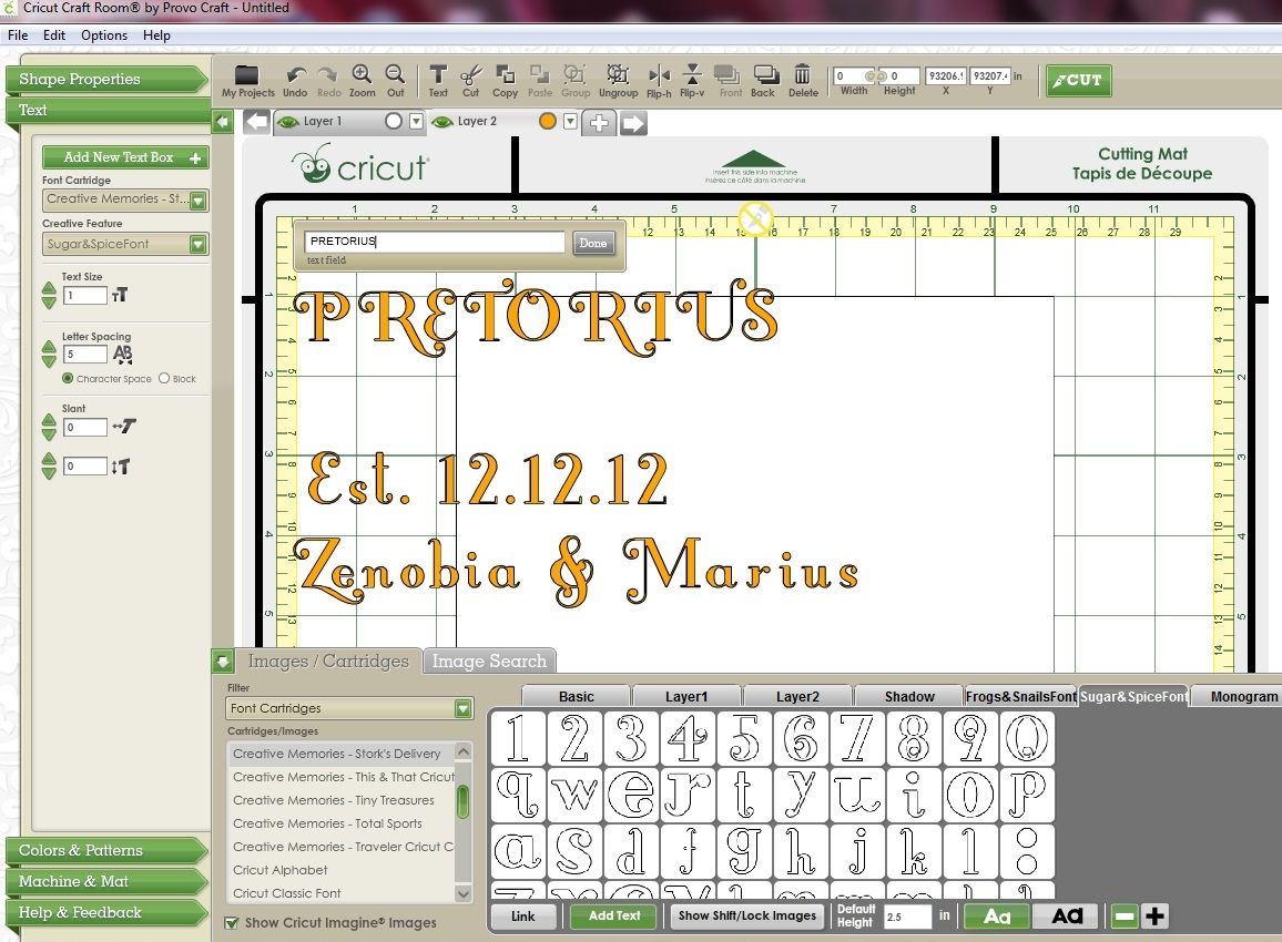
  • Click inside the Text Field box and type your word

As you type the word it will appear on your mat.

You can move the position of the word on your mat by clicking on the grey section of the text box and dragging it to its new position. You can do this before, during or after you have typed your word.

  • Press the Done button to close the text box.

If you need to make changes to your text make sure the word is selected and press the Edit Text button.

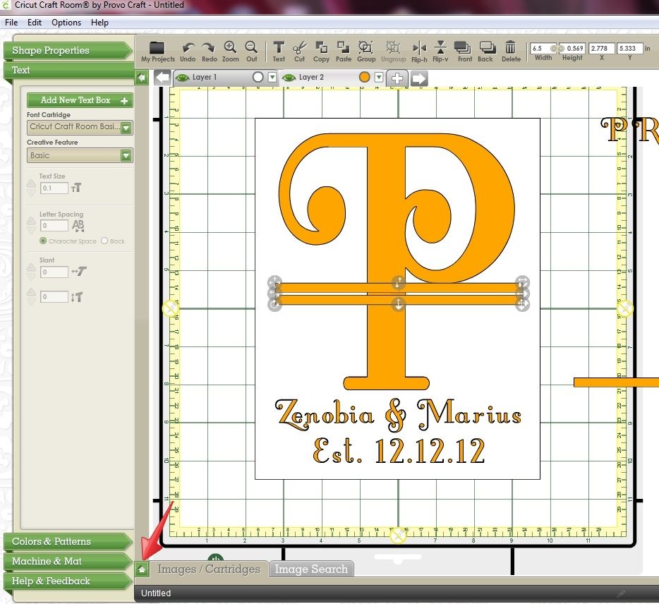
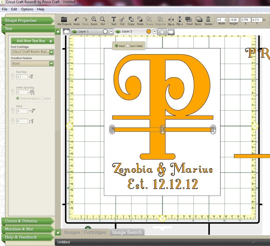
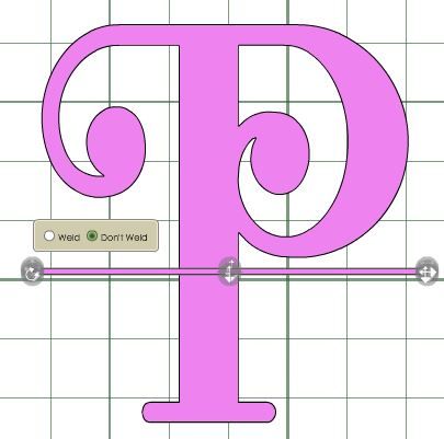
Next we need to move the letters so they overlap.
  • Make sure your word is still selected then press the green Letter Spacing down arrow. (Make sure you have Character Space selected - not Block.

  • Continue clicking the down arrow until your letters have overlapped. (When your letters overlap you will notice that the black border around them disappears.) 
 
Welding occurs as soon as your letters overlap. 


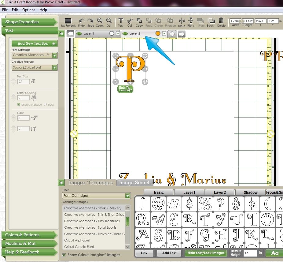
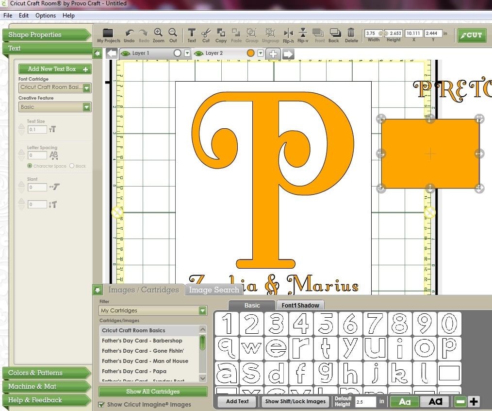
Next we need to create the welded shadow.
  • Click on the tab for your second layer to make that layer active.

  • From the Text menu click the Add New Text Box button
  • From the drop down Creative Feature box, select the Shadow option
 
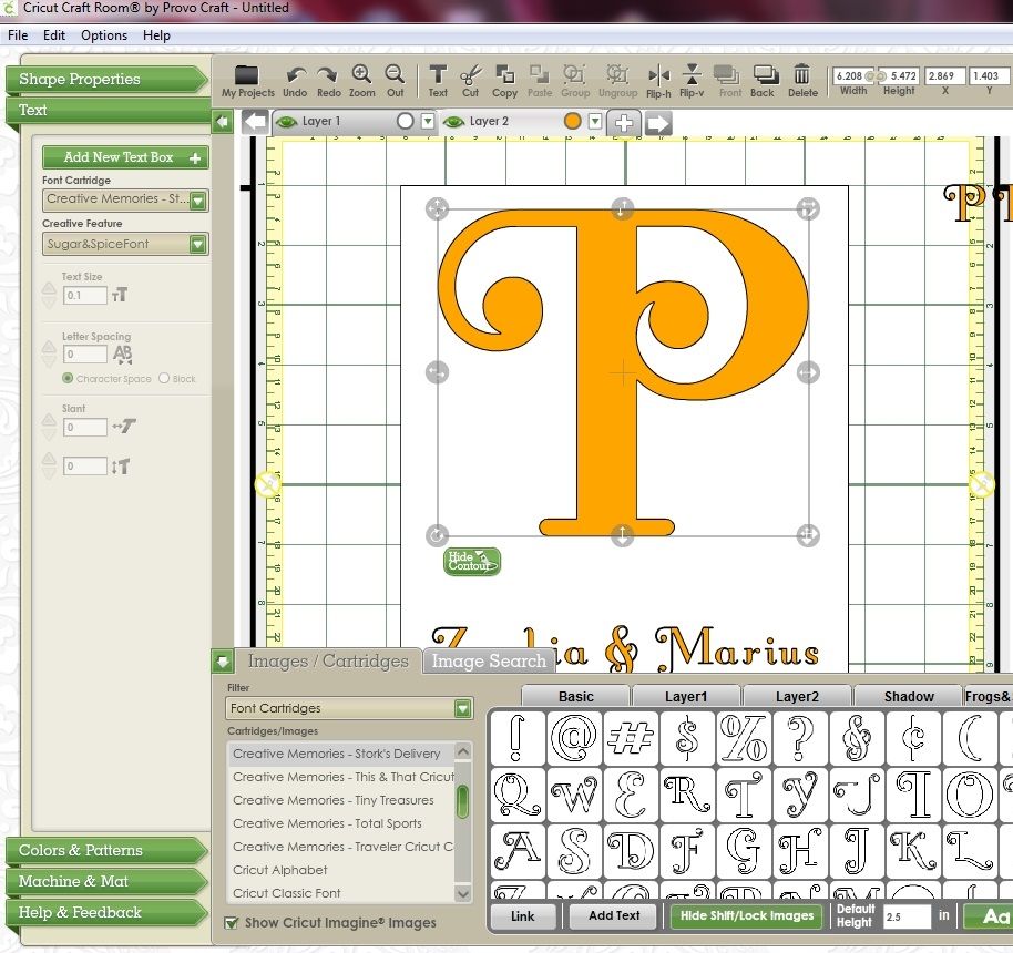
  • Make sure the Font Size is the same as the size you used in the Top Layer
 
  • Click in the Text Field box and type your word again. As you're on the Shadow layer it should show up in a different colour. Click the Done button.
You'll notice that the shadow text will appear on top of the first layer's text. 

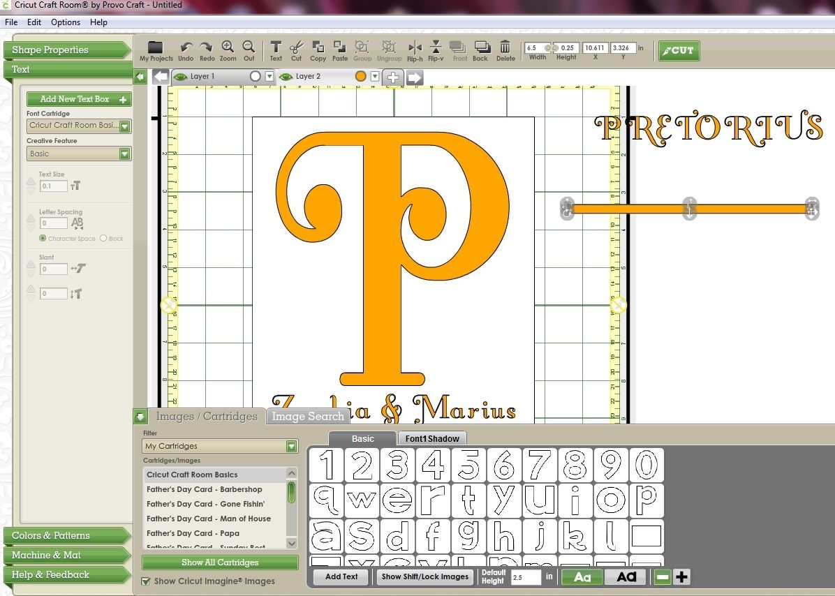
To make it easier to manipulate and weld the shadow move the shadow layer behind the first layer. To do that:

Click on the grey area of the tab for the second layer and drag it to the left. As you're dragging the tab you will see these icons.


Once the Layer 2 tab is over the layer 1 tab release the mouse. The shadow layer will now appear under the top layer. 


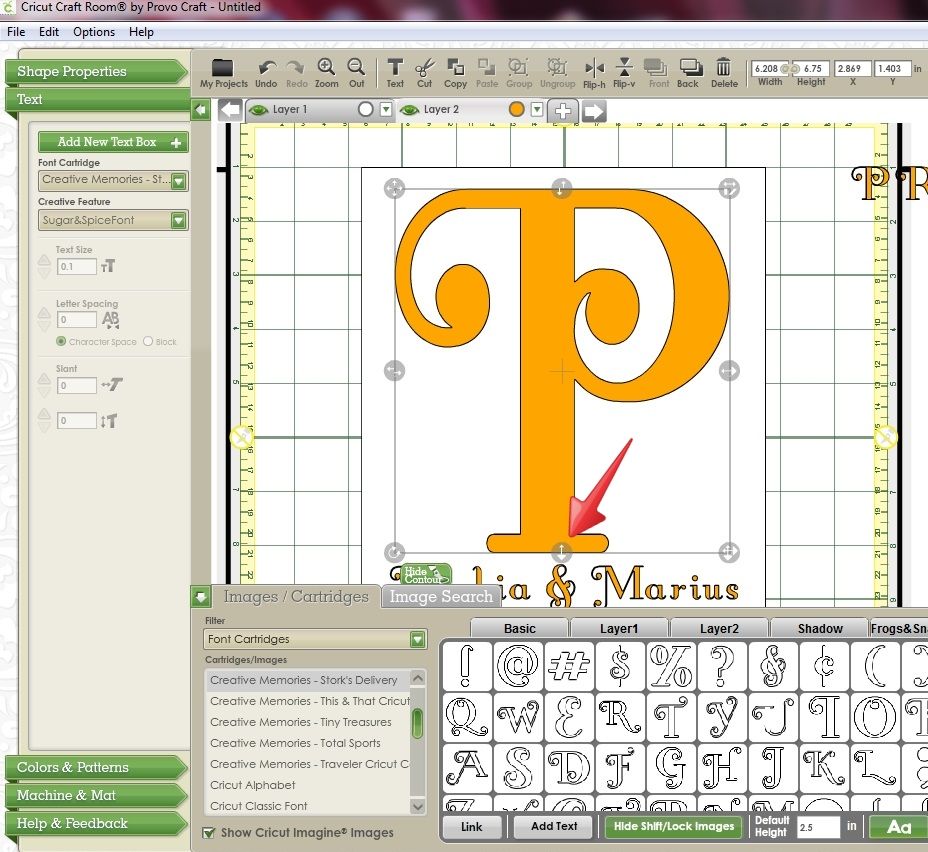
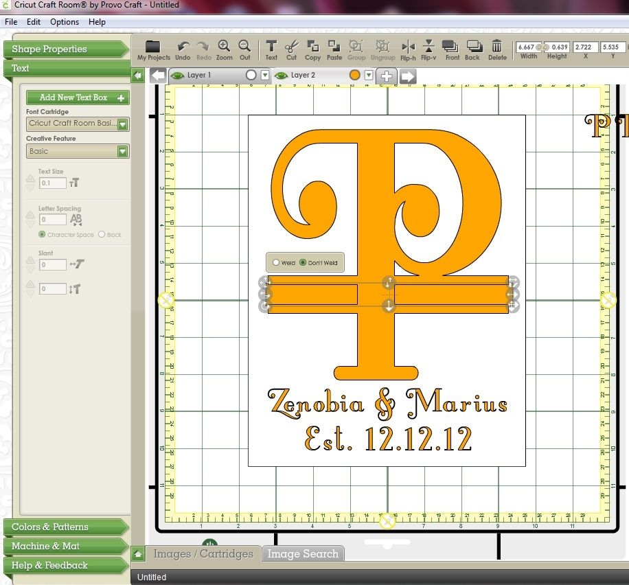
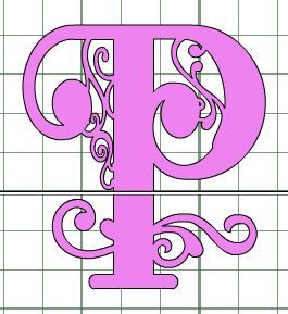
  • Click somewhere on the orange Shadow and using the top left handle, move the whole word so that the first letter sits neatly behind the first letter of the top layer
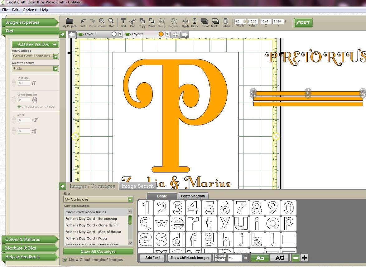
Now you're ready to weld the shadows letters together. However, in this case if you change the Letter Spacing setting, for some reason the top layer and shadow layer won't match up. Go ahead and try and you'll notice that the shadow doesn't quite fit the top layer. 


In this case the difference isn't huge, but with some fonts it's quite noticeable. You'll see how the shadow of the I, N and the G don't match up well and need to drop down slightly.

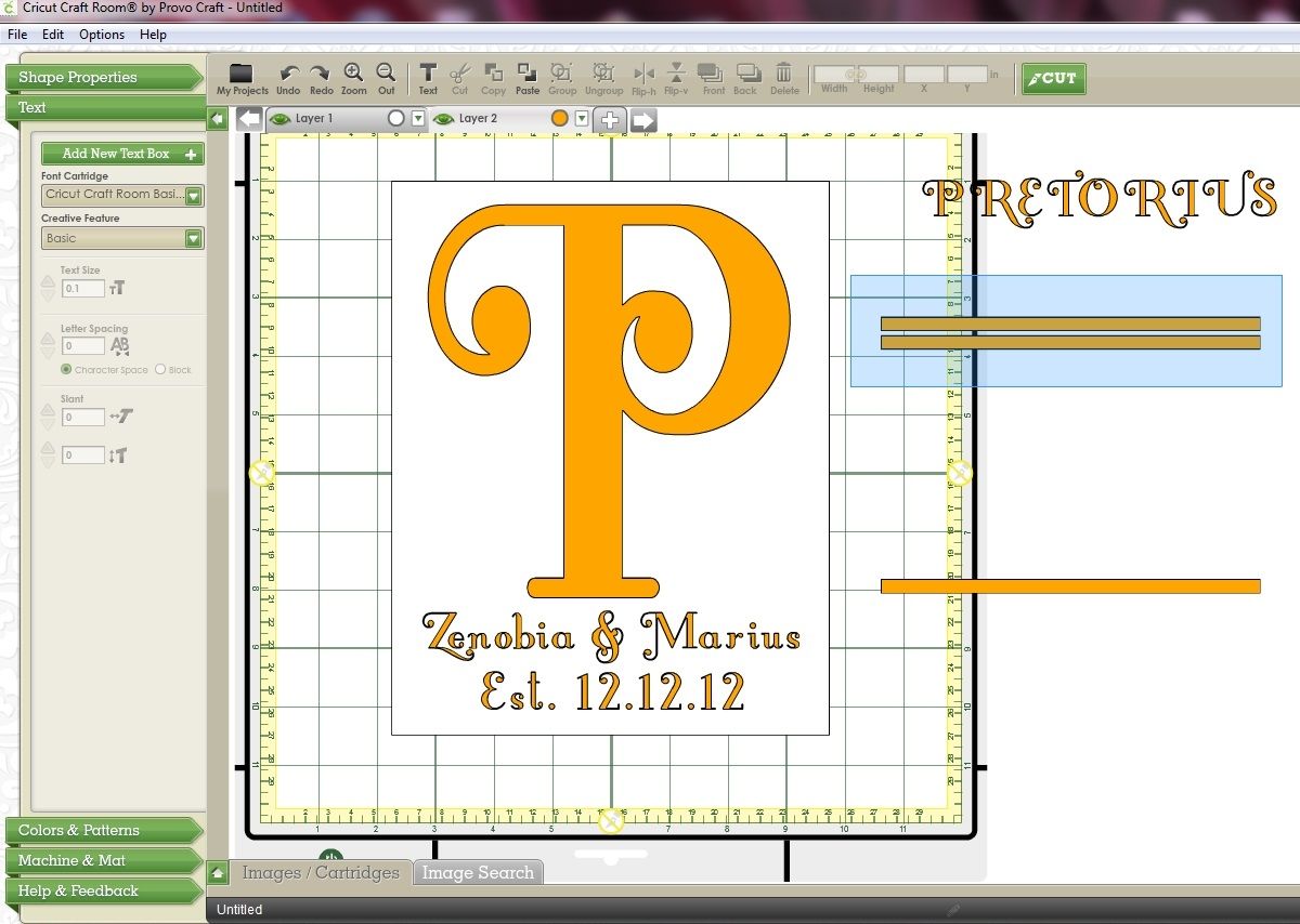
We need to create the welded shadow in a different way. 
  • If you made any changes to your shadow, click the Undo button until you have it back to its original version. (Or delete it and recreate it.)
  • Highlight the shadow again then click the Ungroup button on the Toolbar.

 
Now each of the shadow letters is an individual object and can be moved anywhere.
  • Click anywhere on the mat to deselect the word.
  • Click on the orange P and using the horizontal move handle move the letter to the left until it fits neatly under the yellow P. If necessary use the vertical move handle to move it down. 

You'll notice that the Weld/Don't Weld box has appeared. That's because the S & the P are now individual objects. As soon as they overlap the Weld box will appear. You don't need to change this option so just leave it as it is.
  • Next click somewhere on the orange R and move it over to the left using the horizontal move handle.
  • Repeat for the remaining letters. 

When you get to the I, N and the G you may find that you need to drop them down slightly to get the to align correctly.


Now that you have the shadows letters all aligned you can go back and group them.
  • Click on the yellow layer and move the word down to sit somewhere below the orange layer.
  • Drag a selection box around the shadow layer so all the letters are selected.
  • Click the Group icon from the Toolbar.

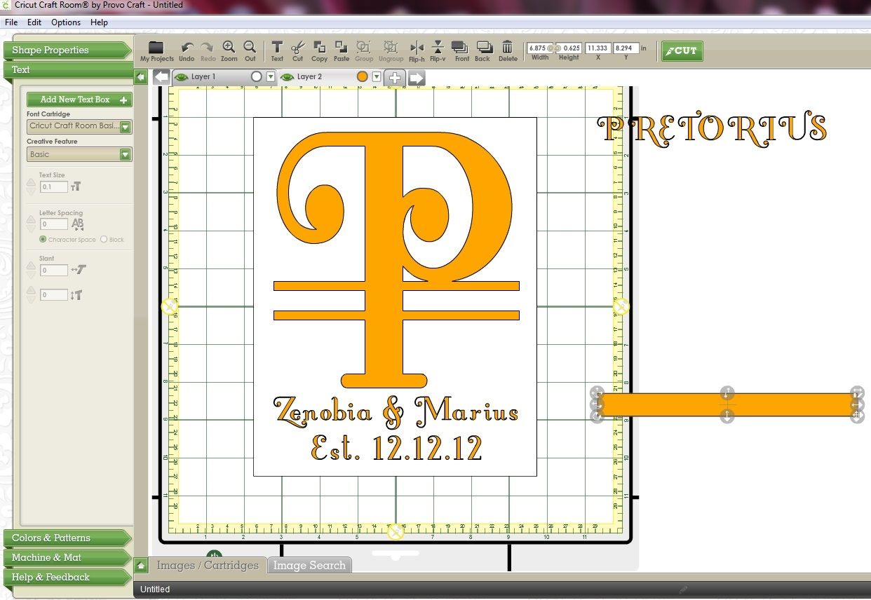
Your shadow word is now one object again and you can click anywhere on it to move it around the mat.

Notes: 
You aren't limited to whole numbers in the Letter Spacing box. You can type any number (eg. 5.3) to get your spacing just right.
It's not necessary to use preview colours. I think it just makes it easier to see your outlines. 

It's also not necessary to use two layers (mats). You can leave the preview colours off and create both your layers on one mat.

Have fun creating your welded shadowed titles!

Monday, May 13, 2013

Time to announce the winner!

Thanks for all the comments on my Split letter monogram tutorial. If you do put one together I'd love it if you could post a link to your project using the Linky tool at the bottom of the tutorial post!

So..... I have just drawn the winner using Random.org


Which makes the winner...


Congratulations Annette!!!  I'll be emailing you soon!


I'm off to do some work on the blog now in an attempt to make it a bit less.... well..... blue! :)

Have a great day and thanks again for joining in on Circleville NSD!

Narelle

Sunday, May 5, 2013

Cricut CCR: Making a Split letter Monogram

Split letter monograms seem to be all the rage these days so I thought I'd put together a tutorial showing how to create one using Cricut Craft Room.

See the end of the post for a video!

A friend of mine was married last year on the 12/12/12 so I'm making this project to give to her for her first anniversary.


Let's get started...

The first thing I do is place a rectangle on my mat to use as a guide for placing my images. The rectangle is the same size as the inside of my picture frame. My frame is 8" x 10" but the inside measurement is 7'5" x 9.5" so that's the size I use.

I used one of the rectangles from Cricut Craft Room Basics.

  • Place the rectangle on your mat and click on the Lock Aspect Ratio toolbar button to turn it off. (It will turn grey.)


  • Then using the Width & Height boxes on the toolbar resize it to 7.5" x 9.5".

To make it easier to see my other objects I'll turn the preview colour of this layer white.
  • Click the preview colour button on this layers tab (in this case it's the red dot) then click the white circle from the Basic Colors palette. Press Apply to accept that change.

  •  To help me centre my text I'll move my rectangle over so that it is centred on the 6" mark.

  • Add a new layer to your project by clicking on the plus button next to the Layer 1 tab.

Now we'll start to add our text.
  •  Make sure the 2nd layer is selected. (Its tab will be light grey.)
  • Click on the Text menu
  • Click the Add New Text Box button

  • Select your font from the Font Cartridge menu. I'm using the Creative Memories Storks Delivery cartridge.
  • Select which creative feature you wish to use. I'm using the Sugar & Spice Font.
  • Select your text size. (You can change that later too.) Mine is set to 1".
  • Type in your text. I'm typing in my friends Christian names. 
  • You can change the spacing between the letters by clicking on the arrows next to the Letter Spacing option in the Text menu
  • Press the Done button when you're finished.


  • Next, add another text box (move it away from the first text box by clicking anywhere on the grey area around the box) and type the date. I like the term "established" so I'll be typing Est. 12.12.12. Press Done when you're finished.


  • Add another text box and type in the surname. This is the text that will be inserted across the monogram when it is split.


  • Move the surname off to the side then position the Christian names and date at the bottom of the large white rectangle. It's best to get your centering done now as you'll be able to lay down all the text onto your glass at the same time.

The next step is to create the monogram letter. Again I'm using the Sugar and Spice font from the CM Storks Delivery cartridge.
  • Select your letter of choice and drag it to the mat. You'll notice that in the picture below my letter is white. That's because at some point I selected the large white rectangle which made that layer active.


  • To remedy that I delete the letter I placed on the wrong layer, click on the tab for Layer 2 then add my letter again. This time it's yellow which indicates it's on the correct layer.


  • Using the bottom right handle resize the letter to fit inside the white rectangle. I made my letter approx 6" wide.


  • I wanted the letter to be longer so I used the bottom centre handle and stretched it to fit.

Now we need to split that letter. We'll use rectangles from the Cricut Craft Room basics cartridge.


  • Select the Cricut Craft Room cartridge from the cartridge filter and drag one of the rectangles to the mat. Make sure you're still on Layer 2.


  • Resize that rectangle. Using the Width & Height boxes on the toolbar I resized mine to 6.5" wide (to give me .5" on either side) and .25" in height. Don't forget to make sure the Aspect Ratio button is still off.


  • Copy that rectangle to the clipboard (Ctrl C) then paste it onto the mat twice. (Ctrl V). You'll now have 3 small rectangles.


  • Move the bottom rectangle away to be used later.
  • Select the other two rectangles by dragging your mouse around them


  • Move the two rectangles over and place them on top of your monogram letter. I placed the top rectangle so it just touched the bottom of the curve in the letter P. Place them where ever you think will look best. 
  • When you move the rectangles onto the monogram they will be automatically welded. (Look for the Weld/Don't Weld button.) Ensure that you keep these two rectangles and the monogram letter welded.
(You may have noticed that I've closed the keypad drawer so I can see my project better. To do that click on the Show/Hide Image drawer arrow (indicated below).


  • Select the second of the two rectangles and move it down. This will form the bottom half of your split letter.


If you have trouble selecting any of the objects on layer two turn off the preview for layer 1 by clicking on the Show/Hide Layer button on the Layer 1 tab so the eye turn grey. (Now that you have everything pretty much lined up you won't be needing that white rectangle.)


  • Now take the third rectangle and stretch it so it is slightly wider than the other two. Then adjust the height so it's approx .65".


  • Move the third rectangle over and insert it in between the other two rectangles. The middle rectangle should slightly overlap the other two rectangles. You may need to move the bottom rectangle up or down slightly.
  • This time click on the Don't Weld button. That means that this rectangle will actually cut separately to the rest of the images on this layer.

Once you've cut and weeded your image this is what you'll be left with.


Below I have moved the surname over so that you can see that it will fit in the gap created. I can still move the bottom part of the letter P down after I've cut it though.


All you need to do now is move the surname below the other text, lay your vinyl on your mat and cut your project out!


  • At the cut settings screen select Layer 2 from the Layer menu and select Vinyl from the "What type of material are you cutting?" menu. Follow the instructions for setting the blade depth etc and cut your project out!


I've squashed all that info into a video for you too! Here it is.....


A little extra info.....

If you don't like the top and bottom bars on your monogram you can omit those. Just use one rectangle to split your monogram, making sure you select Don't Weld.


If you want your monogram to be a bit more fancy shmancy weld some "swirls" to your letter. Do a search for swirl in CCR and you'll find plenty. Close To My Heart - Art Philosophy has some good ones!


Have fun with it and feel free to post your Split letter monogram using the links below.


Related Posts Plugin for WordPress, Blogger...